
The packaging for recordings is a rich but peculiar art form. It’s a very visible piece of art, but the creators are mostly anonymous. It’s creative but also utilitarian, a piece of advertising. Ideally, it represents the artist and the music inside, but it’s also a corporate branding tool for a label. Even a few serious jazz fans might have no idea who David Stone Martin, Burt Goldblatt, Esmond Edmonds or Reid Miles are — but their work for Clef, Verve, Blue Note, Columbia or Prestige would be instantly recognizable to them and evoke entire eras in jazz.
All that seemed destined to become a quaint memory with the advent of CDs in the 1980s. (Of course, CDs along with all other physical music delivery platforms seem now well on their way to becoming quaint artifacts themselves, but that’s a discussion for another day.)
Still, some artists found ways to create original, distinctive work, work that both represented the music and gave it a fighting chance in a desperately crowded marketplace. Consider Stephen Byram.
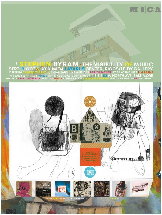
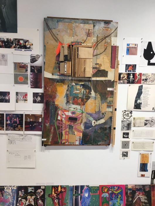
A couple of weeks ago I got a small notice about a major retrospective for artist and graphic designer Stephen Byram, the aptly called The Visibility of Music, at the Maryland Institute College of Art’s Riggs & Leidy Galleries. The name of the artist didn’t ring a bell, but there was something about the images that stayed with me — until I realized I have Stephen Byram’s art all over my place. I live surrounded by his work, framed in packages and jewel boxes from labels as disparate as Blue Note, Winter & Winter, JMT and Tim Berne’s Screwgun, and on CDs by a broad range of artists including personal favorites Django Bates, Paul Motian, and Cassandra Wilson. (Like Byram’s work, the show goes beyond the confines of CD packages.)
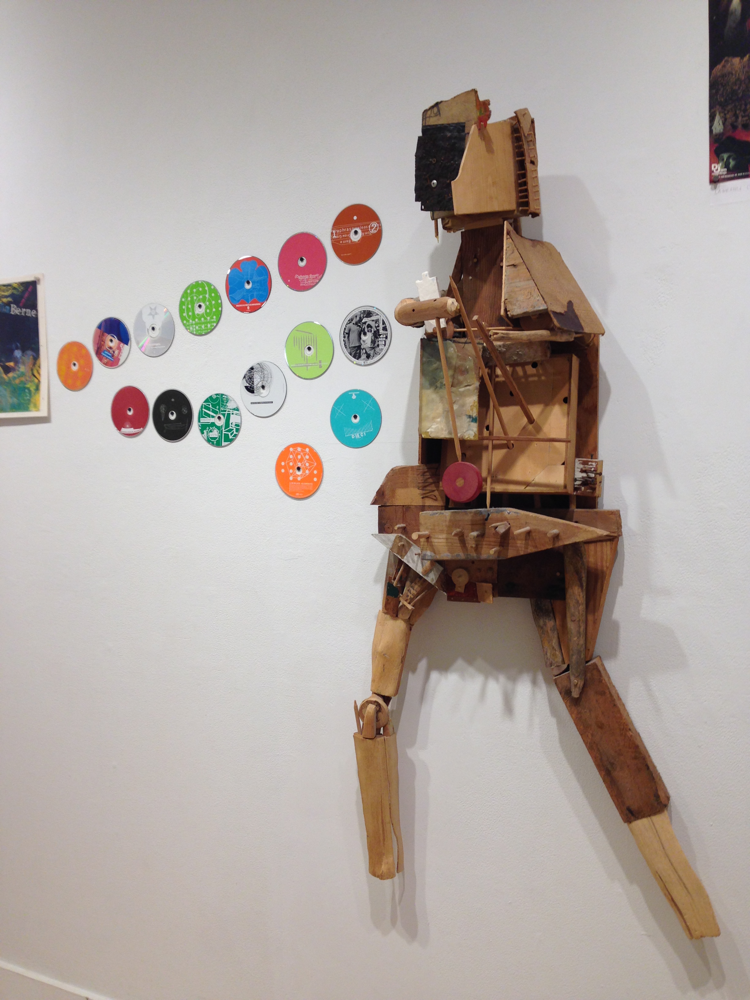
His illustrations and designs aren’t just memorable — and they often are — but they also fairly represent the music inside. He uses very personal imagery that includes distinct choices of typography, drawings, collages cut and pasted with quirky rhythms, and subtle humor. It’s still foolish to judge a book by its cover, but this may give you an idea. Or, as John L. Walters wrote in his feature for the U.K. arts journal Eye Magazine, Byram’s CD packages “always produce a shock of pleasure or surprise. They have an oddness, an awkward individuality that expresses perfectly the equivalent idiosyncrasies of the musicians on the record.”
Byram’s early musical taste, he once conceded in an interview, ran toward rock. Perhaps because even he saw himself as an odd candidate to visually frame and sell Berne’s brand of Avant-jazz, he once asked the saxophonist why he had come to him for a cover. Berne’s response: “I thought that you’re doing the same thing I’m doing, from an art standpoint.” Their association, which started with Berne’s debut release on Columbia Records in 1987, continued for Berne’s own Screwgun imprint.
“His covers are like the music, you can go back to them and always find new stuff,” says British pianist, composer and bandleader Django Bates in the Eye Magazine story. “The thing that gets me is that he has this very recognizable style, but every time you see something by him, he’s come up with something completely new. That’s what people aspire to in music and art and everything.”
Stephen Byram: The Visibility of Music is at MICA (Maryland Institute College of Art) Riggs & Leidy Galleries, Sept 12 – Oct 6 Fred Lazarus IV Center 131 North Avenue, Baltimore, MD 21201
